


The importance of UX in web documentation: Analysis of Lodgify's API
- 1 oct 2019
- 5 min de lectura
Actualizado: 3 oct 2019
UX is present everywhere, even when we don’t notice.
And that is precisely the point, because the moment that we miss it, it’s when it is not working properly. Even when we are developing plain text which is intended to be portrayed on-line, UX is of great importance.
Let’s face it, we don’t read the way we used to, not in the online world. For the sake of this example, I will analyze Lodgify’s API, published in their website, finding some issues and offering solutions for the User Experience.
The picture below is a screenshot of what we can see right after opening it:

1. Inconsistent buttons
And the first issue comes along with it: is the upper left icon a button or just an icon? In case it is a button, where does it link to? Well, it is a button indeed. It may not seem problematic at first, but non intuitive buttons are an issue specially in mobiles, as we can click on them accidentally while scrolling.
The main problem though is that, even if it is a button, where does it link to? My first thought was that it would act as a “refresh” button: if it is the header of the page, it should link to that same page. Then I thought: well, maybe not. The title says “LODGIFY/docs”, not API. Maybe it links to another page which lists all the documentation, besides the API.
Spoilers ahead: both answers are wrong. It is a button, and it links to the Home page of the website.
Why though? There is no clue. Then I realized that, in the upper right part of the page, camouflaged as plain text and grey over white letters, there is a text: “API”, which is actually a button, the intended “refresh” button.
How could this be improved?
It can be done quite easily. If it is the case that you want to use that specific design for the header of the page, just change the text to “LODGIFY/API”, as there is no other documentation, and make it link to that same page. In that case, if the user clicks it accidentally, it will be intuitive to guess where it links and it will not force the user to go back or find a way to return to the API.
The button on the right needs a complete make over though: Now we need a “Home” button that links to the main website, so create one using the logo and the font of the company to make it recognizable at first sight.
I have developed a mockup of how these solutions would look like:

2. Current section:
Another problem comes through as we dive into the API. It is quite a long reading, with lots of sections, subsections, functionalities and much more. After reading and scrolling for a while, the user could suddenly think: okay, where am I right now?
There is an index on the right dividing sections, but it does not state the current position of the user. There is no way to instantaneously know which is the current section. The user should click by intuition different sections to display its subsections (some are really large) and hopefully guess right. It is stated though inside those subsections which is the current one. The problem is that subsections do not display automatically as we progress and section titles are not clearly distinguished during the text. The first picture below displays how the index remains silent until, in the second one, we open the correct one and the current subsection is accordingly highlighted.


How could this be improved?
The problem with the index menu and the section is that those are clickable and it could be difficult, due to clickable menu properties, to try and highlight it. If highlighting the section was trivial, it would be a good solution. If not, well, it is a good moment to use the icon that you have developed for the API page:

Why not using that green dot, which does not disrupt the style of the page and it is recognizable by the user, to state the current section? Take a look at this solution:

3. Overlapping index:
This is an easy one. I dare you to notice the problem:

The problem occurs only when you narrow the window on PC quite a bit (not that unusual when working with the screen in two halves), but always on mobile phones. It hinders both navigation and reading of the text.
How could this be improved?
It could be solved by anchoring the index to the side instead of making the display of the page depending on its width.
The problems with this solution though, are remarkable: it be difficult to implement efficiently with all displays and it will force the mobile users to scroll sideways to look for the index, and that is not desirable.
So, again, we can use the resources created for this page! Using the icon of the header and the the company’s font, create a button anchored to the top of the window that makes the index visible or invisible whenever the user needs it. This would be especially efficient for mobile users. Here there is a placeholder for such button:

4. Unfamiliar section titles:
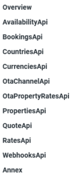
This may not be that obvious, but it is nonetheless, really important: the API starts right when opening the page, meaning that there is bare to none introduction to it. There is a bunch of sections on the right but, especially if we are new to the site, it is not easy to know exactly what they are all about or where should we look for a specific subject.
During the API, when starting a new section, there is a brief description. The main problem is that they are scattered through the place and, being that short, they can be missed quite easily. Look at the pictures below: on the left, section titles listed, on the right, CountriesAPI with its description.

How could this be improved?
Being that these are short descriptions and especially useful for newcomers, why not displaying it at first, as an introduction to the API? That way, users will not have to guess, it will be displayed at first for everybody and gathered up together.
Here there is a fake screenshot of how it could look like, all along with other solutions suggested before:

And so, this analysis is finished. And what have we learned to day? You cannot dismiss UX, not even when you are developing documentation for a software, or any kind of massive text.
UX designers have to think always in behalf of the user: how is that text going to be read? Is there any way to make is experience if not delightful, at least, easier? We cannot intend our users to look at a screen for a long time and read or navigate through text just for mere appreciation or, even worse, need for it. Help them, take care of them and try to make the experience smooth and fresh, as a wind breeze.

Comentarios